MedForward websites are designed to work across a variety of popular consumer technology platforms including desktop computers, mobile phones, and tablets. MedForward also offers a custom mobile site design option to offer a separate mobile version of your website specially optimized for smartphones and Apple's high-resolution Retina Display. By using the latest website frameworks, your website can specifically adapt to four different display modes including large desktop devices, small laptops, tablets, and smartphones.
Our custom responsive designs will dynamically adjust content to the device. This provides ease of navigation without the need for excessive scrolling or zooming to read text. This convenience is highly valued by medical patients.
What sets the MedForward mobile website apart from others is ease of use, full access to all website content, the streamlined functionality, and search engine optimization. Users are never redirected to a mobile home page after finding the page they want from a Google search. Users are not prevented from accessing information that is only available on a full-website. Because the website is responsive, the mobile website provides the same information as the full website.
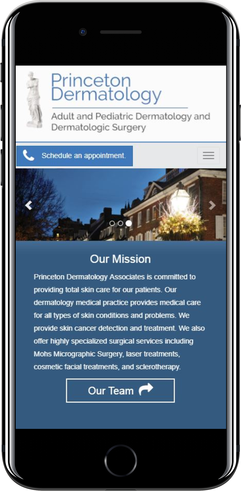
Mobile Design Examples

